It's a Condiment, Not a Color
30. Nashville - The mustard yellow is a putrid look. I'm also very picky about the logos that teams use (and that will be a recurring theme in this list). The combination of an awful color with an awful logo, puts the Preds at the bottom of the list.
Bland and Boring
29. Winnipeg - I was extremely excited to see Winnipeg get a franchise back (albeit from the dissolution of the Atlanta Thrashers) and looked forward to their re-branding of the Jets name. The old logo and uniform were simple, but it was fairly obvious they could not return to that logo set. Boy, did they fail. The chosen logo looks like it came from Clip Art and their color choice is so commonplace in the league that they aren't setting themselves apart at all.
27. Dallas - Another re-branding gone awry. The simplicity camp, when it comes to logos and uniforms, is one I've subscribed to all my life. However, there are occasions where logo's are too simple. This is one of those circumstances.
26. Columbus - When your logo and jersey leave you guessing about the nickname, there's an issue. They are the Blue Jackets, not the insect, but in reference to Ohio's Civil War history. That's cool. Be more creative than a C with stars and stripes is all I'm asking. Their alternative jersey is a beaut though.
25. Carolina - Again, I feel like they left a lot on the table. The nickname of Hurricanes could go many different directions, but again, if you didn't know the name of the team and you were watching their game, could you figure out the nickname? I don't think so.... I do like the simple striping on the jersey. At the same time, a different color set would help. Entirely too many teams in the NHL with red and black as their colors.
24. Ottawa -Hey! More clip art logos! Woo-hoo! I'd like to think the art/design departments with these teams could be more creative. *sigh*
Meh...
23. Colorado - First let me say that I've never been a fan of nicknames that don't end with the letter 's'. Don't ask my why - I just know it sounds weird. I actually like their color scheme because they took basic colors and went into the periphery with them. But the logo.... ugh.
21. Anaheim - Give them credit, they rebounded from the Disney/Mighty Ducks era and came out fairly unscathed on the other side. Their newer logo is interesting as it works the D in with the duck foot. My biggest problem is the color scheme. If you're main rivals main color is black (LAK), why would you then make your main color the same? And there's way too much striping going on in the shoulder and side regions. Slow it down a little.
20. Calgary - Stealing a idea from Paul Lukas at Uni-Watch, I am not a fan of BFBS (black for black's sake). Back in 2000, when they added the black, it was for an atrocious new home uniform. Explain that one to me. Yikes. But they reverted back to the C logo, which was a good call. But they kept the black as a primary color. Boo! I prefer the old red and yellow unis.
19. New Jersey - Once again, it's been a stylish logo since their inception. But after time things become stale and that's how I feel about this logo and uniform set. I did like the change from green to black in 1992. But I think it may be, as Peter Brady would say, time for a change.
Good, But Not Good Enough
18. Pittsburgh - They've tinkered with the penguin a few times in their history. Currently, they are using a version of the original penguin. I like it. But the change to gold from yellow didn't work for me. With the Pirates and the Steelers in town, the yellow worked. It tied them altogether. They need to go back.
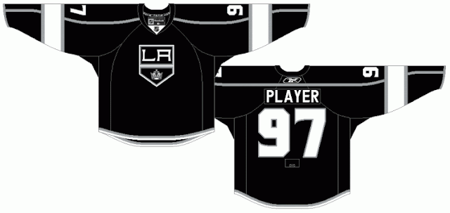
17. Los Angeles - While I liked removing the purple from the uniform back in 2011, I'm still not sure they hit it out of the park with this uni. Maybe a stand up double? Working in the LA to the uniform is a good look, but they get docked points for the deplorable white pants for this years Stadium Series set.
16. San Jose - I miss the stripes at the bottom of the uniform. At the same time, what's with the random orange stripe on the sleeve? I do like the numbers on the front right shoulder of the jersey. Also, I prefer their black jersey's better, but then ALL the California teams would have a black uniform. Ugh. The uniform needs to make sense. This doesn't.
Coming later this weekend - numbers 15 to 1.
Many thanks to Chris Creamer's site for the pictures!
Until then,
Shawn


No comments:
Post a Comment